The difference between the NT555RIIs and the Motivos with regard to traction is astounding… I should have done this last year.
Traffic was pretty horrible on the way back from the tire shop (What is with Texans going 20 under the speed limit at all times?), but I did get a chance to get on it at an onramp – still have to feather the gas on launch, but with warm tires at anything above 40mph you can just mash the loud pedal now.
It’s a long weekend coming up with the 4th being a Friday and all – if the weather holds out I might go goof around in the car a bit.
Having recently replaced the fuel pumps on the Hellcat, I’m pretty sure the reduced fuel flow has been dramatically impacting the car since I bought it.
With the new fuel pumps installed, leaving any traffic light, even casually, spins the tires and creates a spectacle. And this morning I went for a short drive and twice, just going around a corner – in a rather sedate fashion even – the rear end walked out on me.
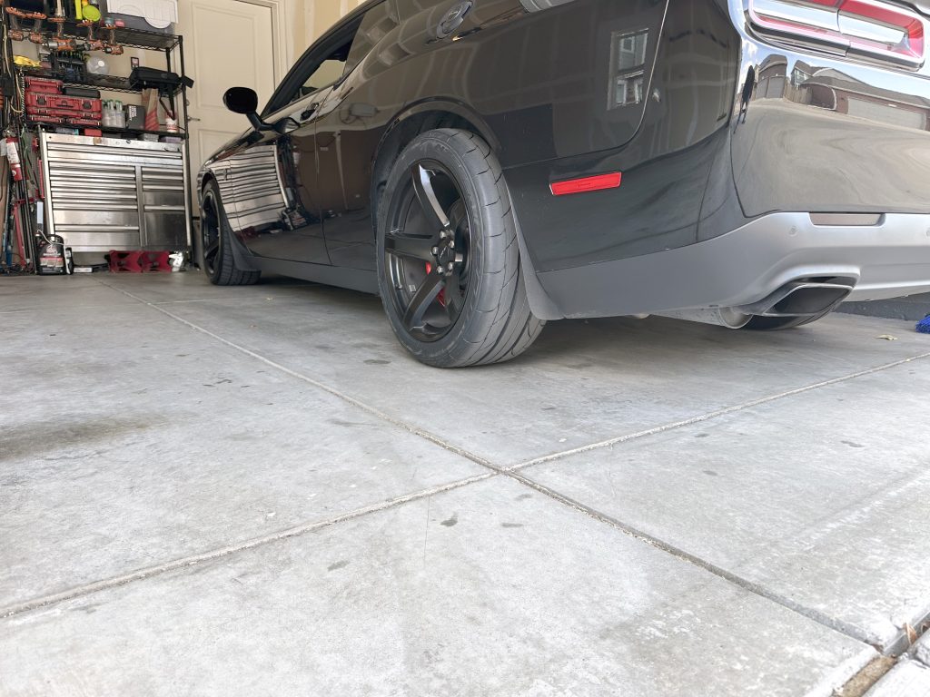
As it stands right now, the Nitto Motivo all-seasons I have on it are dangerous. They are simply too high-milage, nice ride, and low noise for 700+ ft/lbs of torque.
So when I went out for lunch this afternoon I wandered over to the local “Big Brand” tire shop and placed an order for two new Nitto NT555 RII drag radials to be put on the back end of the car tomorrow.
These new NT555 RII tires are D.O.T. compliant drag racing tires made of some rubber sorcery that makes them super sticky while also not instantly killing you if the road gets slightly damp.
They also apparently aren’t terribly noisy or harsh riding either…
Living in the future is pretty cool.
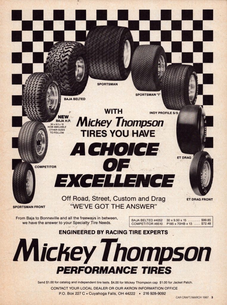
See, back in my day, we had Mickey Thompson if you wanted a race-ready tire – and everyone who hit Bandimere on the weekends drove 50-series M/T Sportsmans or Indys.
1984
But back in those days tires that were great for racing weren’t very good tires to live with; lots of road noise – but you couldn’t really hear the tires over the rattles and exhaust, and they handled like crap – but that was barely noticeable with leaf springs, drum brakes, and bench seats.
I did opt for sticking to the 275 width tires that the hellcat came with just to stay on the 9.5″ rims I currently have. That and the NT555 RIIs in 275 width were a mere $531.99 a piece…
With a little modification to the fender liners in back I can stuff 11″ rims in there (with a +22 offset) and go to 315s while staying under the fenders – but that will require new rims at about $500 each and the NT555 RIIs in 315 width are about $600 a piece.
I’ll probably do that next year when I have to replace the tires I just bought… Which is really the biggest down-side to the drag radials – they’re good for 5-6000 miles, tops. So they turn into an every spring purchase.
Gotta pay if you want to play I suppose.
The only other real down-side I can find on these tires is the warning label stuck to them that states if you move the car at anything under 20 degrees the tires might crack… Not a big deal as I don’t drive it in the winter, but still an interesting warning.
During the week I normally eat breakfast at home before I head into the office, but today I decided to splurge and get something on the way in.
I drive right past a CFA, so it’s on the way, and they make a pretty good egg, sausage, cheese bowl-thing – so that’s where I stopped.
It was a quarter to seven in the morning, so the place wasn’t busy and at the drive through window the manager meets me to talk cars for a few minutes.
He looks over the Hellcat, nods, and asks the usual questions:
Hellcat?
Yep.
Supercharged?
Yep.
How much horsepower?
About 800.
How fast is it?
I’ve done a quarter mile in 11.7 at 127mph, and 0-60 is about three and a half seconds…
After the usual questions he shows me a photo of his 2020 Shelby GT500 mustang. It looks pretty nice and he says it runs about the same in the quarter on a modded upper pulley and an E85 tune.
Anyway, this goes on until the next car pulls up behind me and he hands me my food and drink – and tells me it’s on the house and to have a nice day.
So, there ya go – if you’re looking for an excuse to buy a $70,000 race car, you can occasionally get free breakfast with it.